How Many SUMs Do We Need?
TL;DR
Geocene is regularly contacted by folks with plans to deploy less than 100 SUMs to “quantify” the adoption of tens of thousands of stoves (<0.1% coverage). Intuition says that this sample size is too small, and it is. I talk about how the sector got into this statistical mess, then, I leverage Geocene’s unique world-leading SUMs dataset to calculate a statistically-significant SUMs sample size.
I do this using a neat technique called bootstrapping. I show how bootstrapping works, and I explain in plain language what it means to sample for a given confidence interval and error. What I demonstrate is that the current methodologies will lead to adoption estimation errors of more than 50%! To fix this, most real-world projects need at least 1000 SUMs to reach statistical significance, and as a rule-of-thumb, most projects should deploy SUMs on 5% of their cookstoves.
Intro
Statistical sampling is vital to ensuring reliable and accurate study outcomes. As a sensor company, accuracy is our top priority. That’s why I have been dismayed that so many carbon finance projects are deploying just a few SUMs to monitor large fleets of cookstoves. The wildest ratio to-date was a project with 50,000 cookstoves that was going to estimate adoption of all 50k cookstoves by measuring just 30 stoves with SUMs.
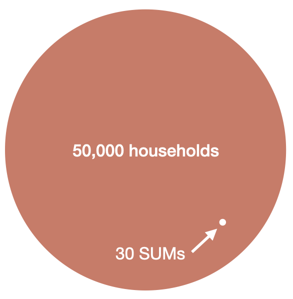
A visual representation of the size of 30 SUMs compared to 50,000 households. If the area of the big orange circle represents a 50k-household carbon finance project, the tiny white circle represents the number of households that some projects are monitoring with SUMs to “quantify” the adoption among all 50k households.
Almost always, the conversation goes like this: “I am developing a new carbon finance project using Gold Standard’s TPDDTEC methodology, and the methodology says I only need to monitor 30 stoves.” I believe this is both a misunderstanding of the methodology and a failure of the methodology to enforce high standards. Specifically, the methodology says:
A statistically valid sample can be used to determine parameter values, as per the relevant requirements for sampling in the latest version of the CDM Standard for sampling and surveys for CDM project activities and programme of activities. 90% confidence interval and a 10% margin of error requirement shall be achieved for the sampled parameters unless mentioned otherwise in the methodology. In any case, for proportion parameter values, a minimum sample size of 30, or the whole group size if this is lower than 30, must always be applied.
What’s happening here? The methodology has two incompatible requirements: it clearly states that the project should achieve 90% confidence interval at 10% margin of error, but it also suggests that a sample size of 30 should probably suffice.
Here’s what I think happened: when writing the methodology, the authors remembered from Statistics 101 that n=30 is a special number. This is typically the rule-of-thumb sample size for the central limit theorem to take effect. This is also the sample size where it’s typically safe to switch from using the Student’s T-Distribution to the Normal Distribution. In other words, a naïve understanding is that samples larger than 30 are “big” and samples less than 30 are “small.” However, 30 is not a magic number, and it certainly has nothing to do with achieving 90% confidence interval at 10% margin or error when trying to estimate a population’s cookstove adoption.
Non-Gaussian Distributions
One of the main reasons that the sampling strategies specified in the methodologies are broken is because they seem to assume that cookstove adoption is Gaussian. If we imagine a big group of people cooking, we might think that their average daily cooking times look like the bell curve below. This curve indicates that most houses cook, on average, between 40 and 60 minutes per day, and that not many households cook much more or much less than that. A reasonable guess, but very wrong!
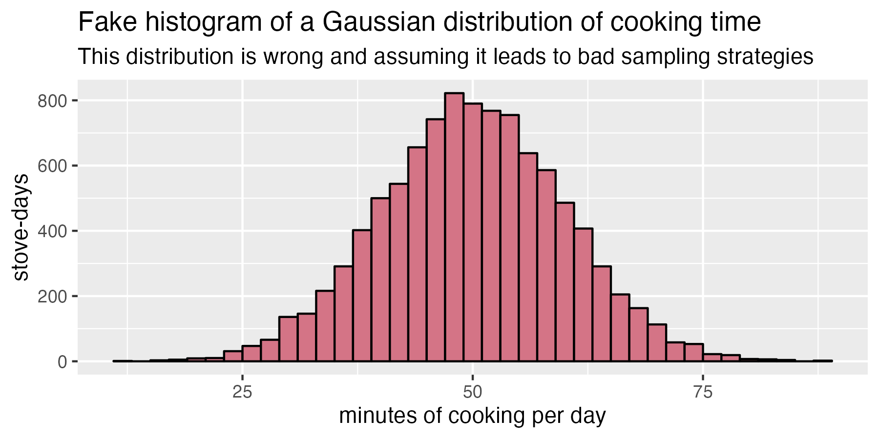
A histogram of fake cooking data assuming a Gaussian probability density function of daily cooking duration. If we assume cooking behavior looks like this, we will dramatically under-estimate the sample size we need!
So what does real-world daily cooking look like? Geocene has the world’s largest dataset of real-world cookstove usage behavior. This dataset comprises 15,000 households in 25 countries cooking 5 million meals over 2.5 million days. That’s a lot of beans! If we plot what cooking looks like in the real world, we get the histogram below. Notice the massive spike at zero minutes of cooking per day: many cooks either do not ever use their cookstove, or they only use it on certain days. Critically, the shape of this curve is non-Gaussian, so we cannot use Statistics 101 rules of thumb to estimate adoption for a probability density function with this strange shape!
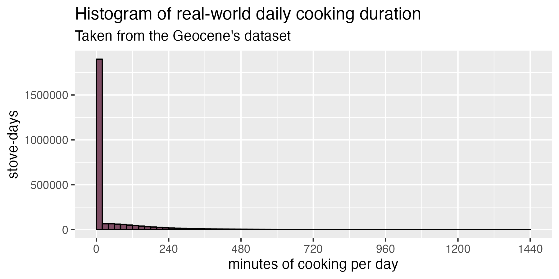
Real cooking data taken from 2.5 million days of real household behavior. Notice how different this chart looks than the one above.
The spike at zero cooking overwhelms the whole chart, so if we want to see what non-zero cooking days look like, we can just hide all the zero-minute cooking days. Then we get a distribution that looks sort of log-normal as shown below.
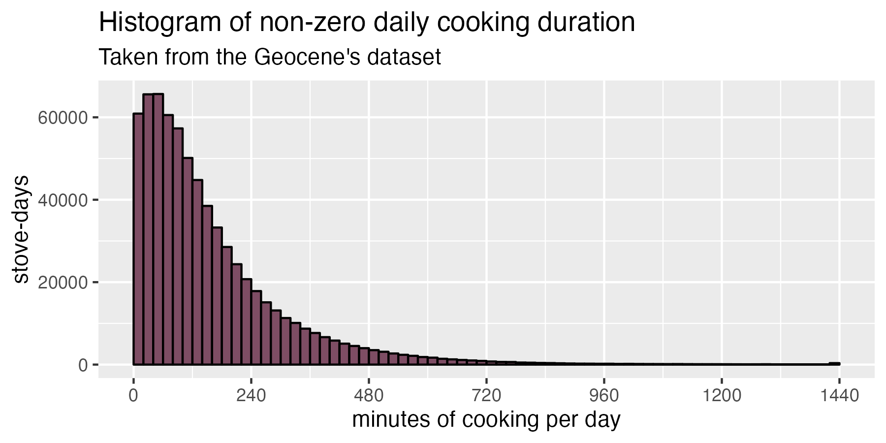
If we remove all zero-cooking days, we can see the remaining non-zero days follow a shape that looks closer to a log-normal distribution.
Bootstrapping
Using statistical theory to determine a sample size for a particular confidence interval and error is very complex for non-Gaussian data. But, we have another option: we have this huge lake of data to work with, so instead of doing a bunch of complex (and dubious) math, we can instead just run tens of thousands of synthetic cookstove studies with different numbers of SUMs and see what would have happened.
Ultimately, what we’re trying to do here is figure out how few households we must sample while still maintaining a good estimate of all households’ behavior. Geocene’s dataset is so large that we can just imagine that the full dataset is “all the households.” Because we already have a huge variety of real data, we can just sub-sample this real data to create a synthetic sensor-monitored cookstove project and then measure the synthetic project’s real error.
Imagine this: we choose 100 random households from Geocene’s 15,000-household dataset to simulate a 100-SUM study. We calculate the average stove use of the sample and compare it to the true average stove use of the population. We do this over and over, taking 100 random households out of the larger dataset thousands and thousands of times. Each one of these samples is its own little simulated “cookstove project” where we just measured 100 households. This numerical technique is called bootstrapping.
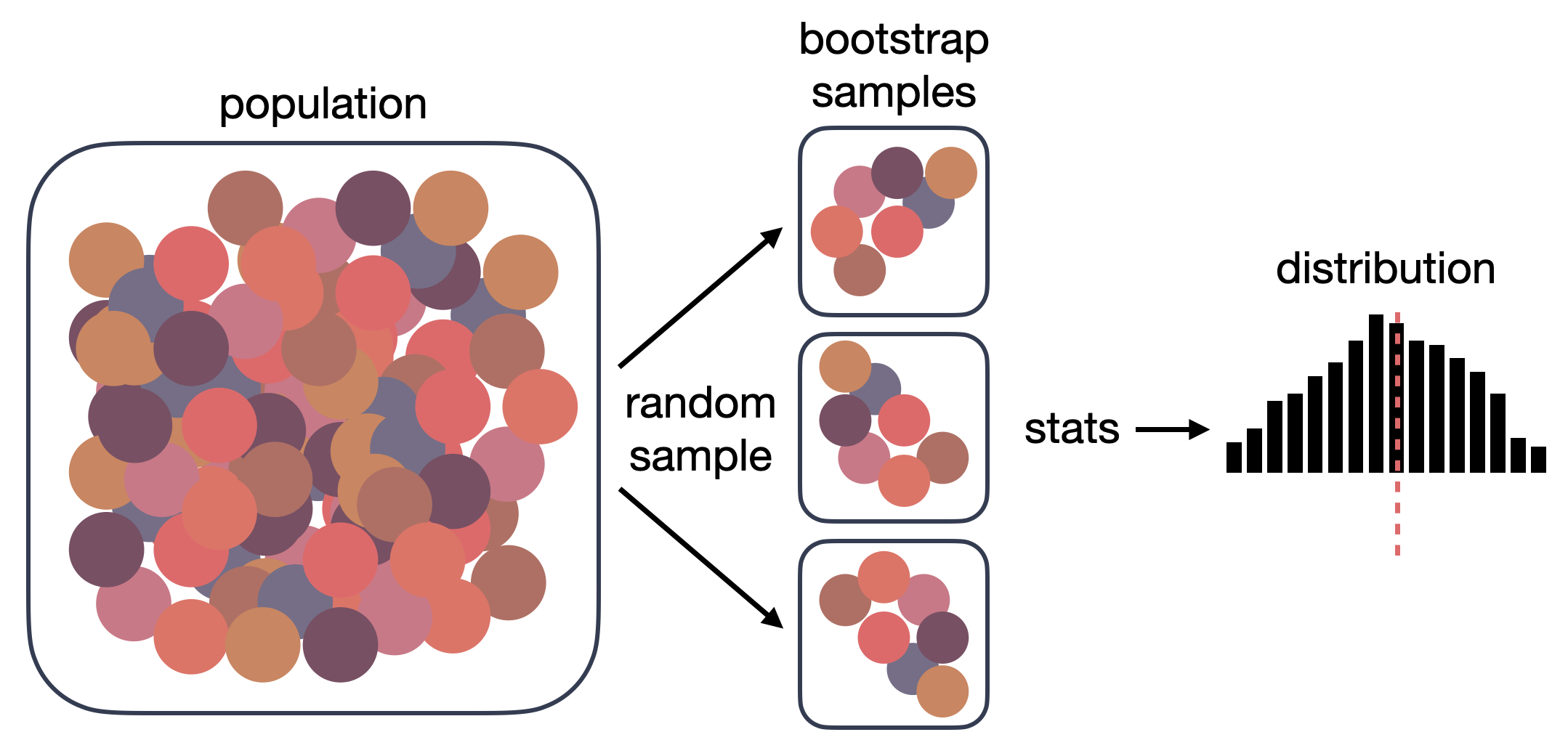
Graphical representation of bootstrapping
We cannot measure real error — we can only estimate it. This is because, in real life, we don’t know the truth. If we measure the height of 1000 Californians in order to estimate the height of the average Californian, we cannot say how much error our estimate has. We could only report the error if we knew the true average height for everyone in the state, and if we knew that, we wouldn’t be sampling in the first place!
However, when we bootstrap, we know the “true” population average from the large starting dataset. A key assumption of bootstrapping is that the dataset we’re working from is large enough to accurately represent the underlying variance within the population. Given that we know the “true” mean when we bootstrap, we can keep track of how error-prone each sample was. That also means that we can look at the thousands of simulated projects and ask questions like “what was the average error for all of these projects?” or “how often was the error for any given simulated project below a particular value?”
Remember, Gold Standard wants “90% confidence interval at 10% margin or error.” What does this mean in lay terms? It means that, if we were able to hypothetically run our study 100 times, 90 out of 100 times our study would estimate the true amount of cookstove adoption within 10% error or better. But that might still be a bit confusing. Let’s tell a story in order to build a better understanding.
Bootstrapping hypothetical in Guatemala
Intuitively understanding confidence interval and error is pretty mind-bending, so let’s imagine a more tangible hypothetical: there is a community in Guatemala. We have been disseminating lots of improved cookstoves there. Our job is to put SUMs on some subset of cookstoves so that we can estimate how much the whole community uses their stoves.
Imagine for a moment we were omniscient: we peer into every home and track their every meal, and we find that, on average, people use the improved cookstove 5 hours per day. As omniscient super-beings, we would not need SUMs, but stay with me. I’ll mention this “5 hours per day” true population mean number a lot in the subsequent discussion and charts, but try to remember: in real life we cannot know this number, we are only pretending we can know it here to help with the explanation.
100 SUMs
Back in mortal being world, we deploy 100 SUMs into the community, and we find out that they used their cookstoves, on average, 4.0 hours. This estimate, 4.0 hours, is pretty close to 5 hours, but has 20% error. Let’s make the world’s most boring chart by plotting this one experimental estimate on a histogram:
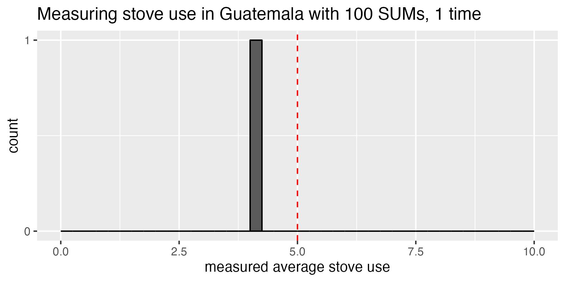
So far, we have just run our 100-SUM study once. The red dashed line represents the true population mean that only an omniscient being could know.
Now, let’s imagine we beg our funder for more money. We want to do the same 100-SUM study 10 more times, but with a different sample of households each time. We measure the average cookstove use in each subsequent experiment as 4.0, 5.8, 6.1, 5.2, 5.4, 5.0, 3.6, 3.4, 3.8, and 4.3 hours per day. Here’s a histogram of what that looks like:
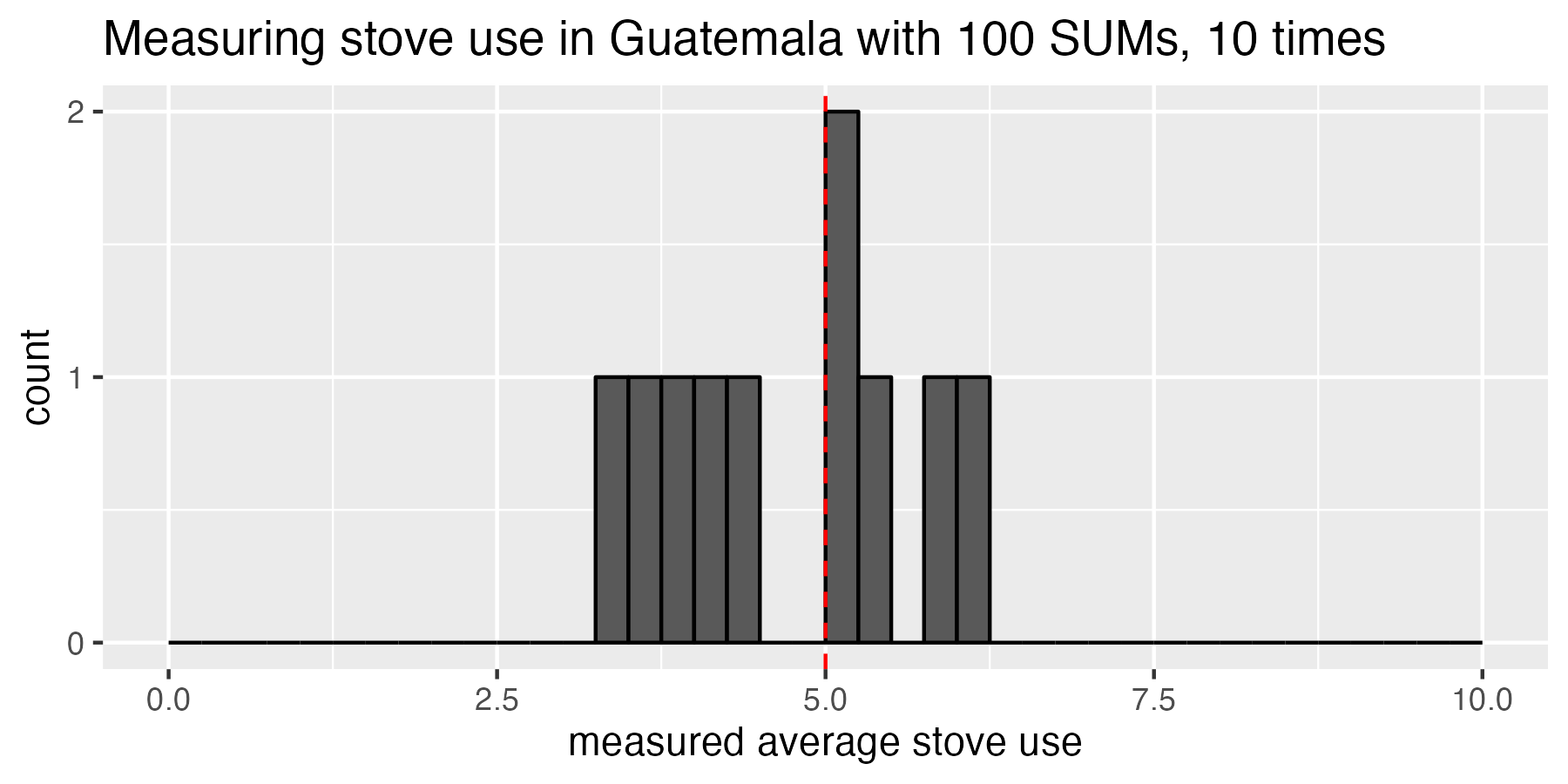
Running the study 10 times, we can start to see that sometimes we estimate very close the true mean (5 hours/day), but sometimes we are pretty far off
Our funder is really happy with our work of re-running the same experiment over and over, so they agree to give us even more money to deploy 100 SUMs for a total of 10,000 experiments! Thanks, Funder! Now we can really see that the data is starting to center on 5 hours per day. Still, while it’s centered on 5 hours per day, some experiments thought adoption was as low as 2.5 hours per day while others thought it was as much as 7.5 hours per day. Quick aside: although the distribution of cooking times in the population is non-Gaussian, the distribution of estimates of cooking time for multiple experiments is Gaussian (this is the Central Limit Theorem in action).
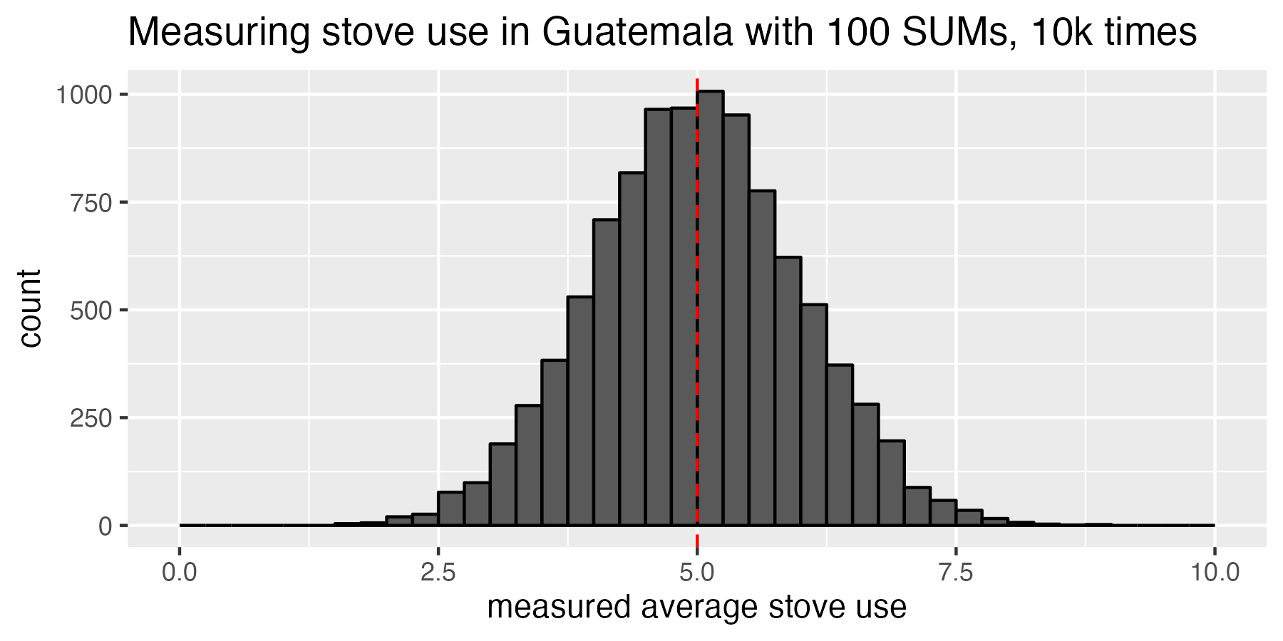
Running the study 10k times, we can see that our studies centered around the true population mean of 5 hours per day, but had quite a bit of spread. Some studies thought adoption was as low as 2.5 hours per day, and other studies thought it was as much as 7.5 hours per day. Remember that we’re not looking at a distribution of how many hours per day people cook; we’re looking at a distribution of sample means for multiple experiments that estimate population cooking.
Why am I going through this long and drawn-out Guatemalan cookstove study hypothetical? Because I want to help us understand what the methodologies mean by “confidence interval” and “absolute percent error.” For the purposes of this exercise, think of the relationships between confidence interval and error as “the percentage of experiments where the outcome falls within the acceptable error.” For example, a 90% confidence interval at 10% error would mean that “90% of all the experiments we did in Guatemala should have an outcome that is within 10% of the true mean of 5 hours of cooking per day.”
Using the 10k-experiment histogram we just made, let’s shade the area that represents ±10% error. We will color this region green, and it comprises all experiments that measured a sample mean cooking (average cooking for the 100 households measured) between 4.5 and 5.5 hours of cooking per day.
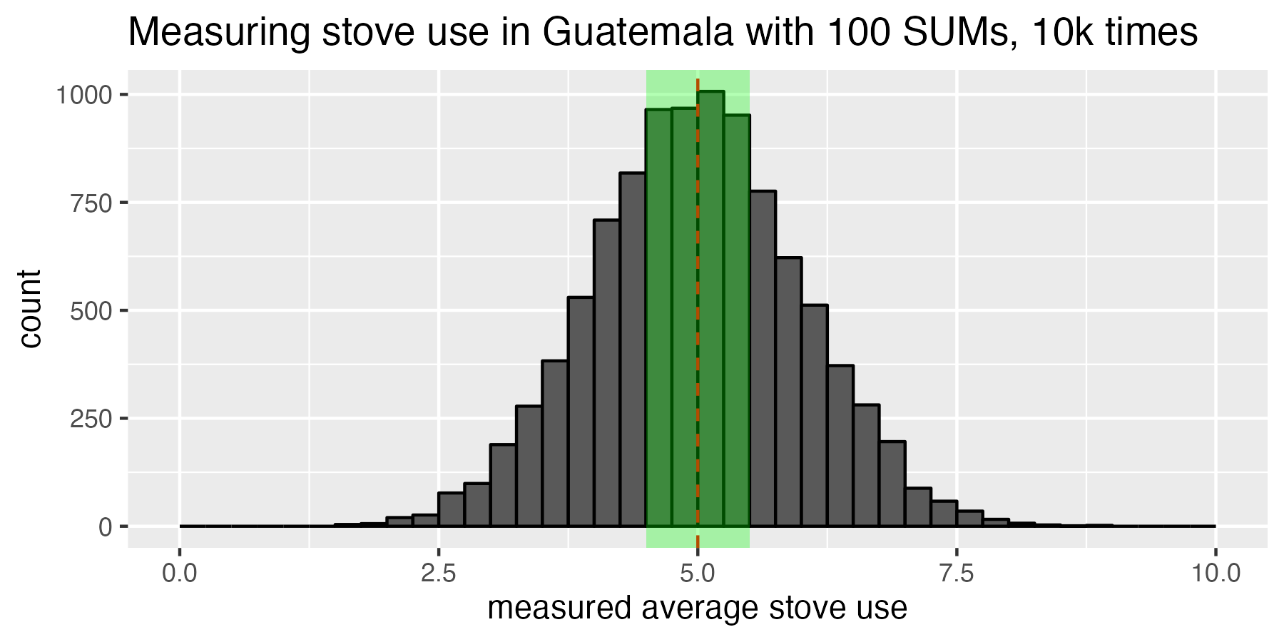
The green shaded region represents the experiments whose sample mean fell withing plus or minus 10% of the true population mean. This green shaded region is the acceptable range of error, and the confidence interval tells us that we want 90% of the experimental outcomes to fall in this green box.
It doesn’t look like 90% of the data is inside that green box. In fact, it’s only about 38% of the data. How should we interpret this? In real life, we only get to run our experiment once, so we can think of this 38% of experiments falling into the green box this way: for the one real-life experiment we actually get to run, there is a 38% chance that our measured cookstove usage will be within ±10% error of the true population mean. In other words: a sample size of 100 SUMs results in 38% confidence interval at 10% error.
1000 SUMs
This is disappointing. We didn’t achieve the goal of 90% of our experiments falling within ±10% error. If we want more experiments to fall into the green box of acceptable error, then our only choice is to increase our per-experiment sample size. We need to use more SUMs! Let’s redo our 10k-experiment campaign, but this time we convince the funder to deploy 10 times more SUMs: 1000 SUMs per experiment rather than 100. We see in the histogram below that things look much better. Now 90% of the 10k experiments we did fall within the ±10% error of the true population mean target we were hoping for. In other words, we have achieved the correct sample size (1000 SUMs) for 90% confidence interval at 10% error.
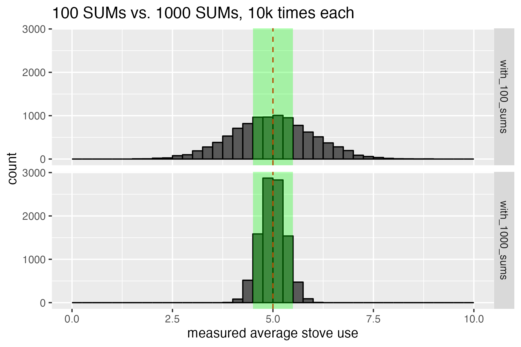
When we use 1000 SUMs instead of 100 SUMs, we get a much tighter distribution. Now 90% of the 10k experiments we did fall within the ±10% error of the true population mean target we were hoping for.
So, we’ve done it. We have figured out what is meant by “confidence interval” and “margin of error” in the methodologies. I always think of it this way: if someone says “I need 90% confidence interval and 10% margin of error” then I think “OK, if I could run my study an infinite number of times, then my goal would be to set my sample size so that I measure within 10% error or less of the true population mean at least 90% of my experiments.” Confidence interval and error must always be specified in a pair. Taken individually, margin of error and confidence interval don’t mean anything useful: it’s not logical to say “you must measure cookstove adoption with less than 10% error.” Because, in real life, there’s no way to know what the true population mean is, so how would we know if we measured it within 10% error? All we can say is, “I am 90% confident that I measured cookstove adoption to within 10% error.”
Bootstrapping Geocene’s core dataset to determine SUMs sample size
Now we get to move on to the good stuff. We can bootstrap Geocene’s big dataset. Bootstrapping the dataset is analogous to running the repeated experiments in Guatemala, but we don’t need a generous funder. Having a dataset as large as Geocene’s is like having deployed SUMs in every home in Guatemala already: we know what the true population mean is before we start, and we can run experiments computationally by randomly sampling households out of the data.
Before I really get going, I want to thank my friend and frequent collaborator, Jeremy Coyle. He is a world-class statistician, and he helped me out a bunch with this analysis. Thanks, Jeremy!
First, let’s get an idea of what it would look like to deploy either very few or very many SUMs into real-world households. In the figure below, I have simulated deploying 30, 300, 3k, and 30k SUMs. Each of the colored lines in the chart is an “isopleth.” These isopleths show us the combinations of possible confidence intervals and errors that we could achieve. Remember that green box from the histograms in Guatemala? Remember that we arbitrarily drew that green box at 10% error, then counted the number of experiments that fell inside that box in order to determine the confidence interval. If we drew that green box at 20% error, then 30%, then 40%, and so on, we would have a paired list of confidence intervals and errors for a given sample size. That’s what these isopleths are: every possible combination of confidence interval and error for each sample size.
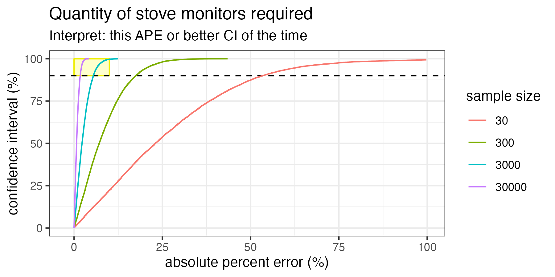
Deployments between 30 and 30k SUMs into real households from Geocene’s core dataset. Each line is an “isopleth” which represents the confidence intervals and errors that can be expected for each sample size. Deploying 30 SUMs would result in more than 50% error at 90% confidence.
The methodologies want us to achieve at least 90% confidence at 10% error, so I have highlighted that “target accuracy region” in yellow. We can see that only the 3k and 30k¹ SUMs deployments are large enough to intersect with the yellow box. Therefore, only these sample sizes would be large enough to meet the goals of the methodology. Importantly, this chart also demonstrates that deploying just 30 SUMs as suggested by some methodologies would result in more than 50% error at 90% confidence interval!
Let’s zoom in on just the yellow box, and run a bunch of other SUMs sample sizes to see what would work to meet our accuracy goals.
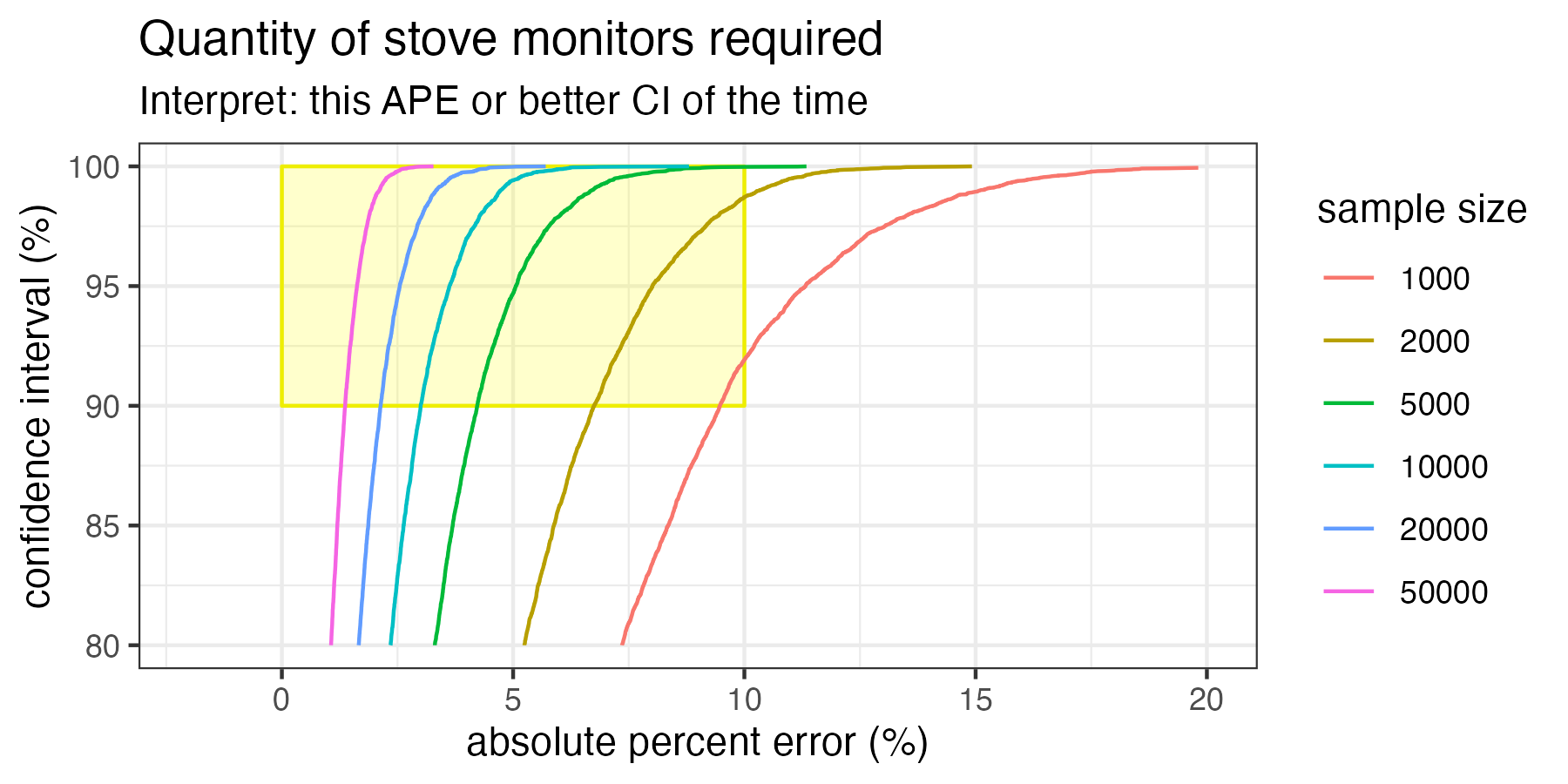
This is the most important graph! What we can see here is that, even in ideal circumstances, 1000 SUMs in the minimum sample size to achieve at least 90% confidence interval at 10% error when sampling households like the households in Geocene’s dataset.
If you only take one thing away from this article, take the chart above. Here we see isopleths that intersect the target accuracy region. Of note, 1000 SUMs is the minimum number of SUMs required to just barely hit our target accuracy. And that assumes everything goes perfectly: we get all the data back, there’s no participant attrition, no sensors break, all the data is analyzed and none has to be thrown away for quality control purposes, etc. Additionally, this also assumes that we do not want to measure the variations between distinct groups. For example, we are going to treat all customers as one homogenous group and don’t need to know the differences in adoptions between different subsidy levels, age groups, income ranges, etc.
You don’t need to have a degree in data science to know that 1000 is a much larger number than 30. So why are so many carbon finance projects woefully under-monitoring their programs? Because the methodologies allow (and even suggest) that only a tiny number of sensors are needed.
Some caveats
There are some limitations to the analysis described.
First, this analysis assumes that we are trying to estimate the adoption of a very large group of households. In other words, the total number of households is in the tens or hundreds of thousands. If we had a very small carbon finance program, and we were only trying to estimate the adoption of 100 households, we could do that perfectly with 100 SUMs (100% sampling). But those are not the kind of projects we’re worried about here: we’re worried about large, expensive, impactful projects that typically distribute between 50k and 1M stoves at a time.
Second, bootstrapping assumes that the study population behaves similarly to the households in Geocene’s dataset. Geocene’s data comprises a vast quantity of countries, cultures, cooking habits, and adoption behaviors. Frankly, it’s as good of a guess as any with regard to how the population will behave. If anything, it’s likely more heterogeneous in behavior than any one carbon finance project will observe, so in that sense these estimates are a little conservative.
Third, random sampling is critical. If a carbon finance project only installs SUMs on golden households who have been coached, coerced, or just hand-selected for normative behaviors, then all of these fancy statistics don’t help estimate true population behaviors. Sampling only works if it is random, so great care must be taken to ensure that projects are not taking convenience samples, or worse, committing overt fraud.
Fourth, if someone asks me “how many SUMs should I deploy?” I rarely say “well, let’s break out the isopleths and take a look at where you want to fall in the confidence interval vs. error space. Instead, I usually say “5% of your study population.” Why is this a better answer than looking at the isopleths? Because 5% coverage almost always satisfies these real-world requirements
- 5% of any large study will almost always fall into the yellow target-accuracy box, even with sensor, participant, and data attrition.
- 5% is an affordable level of sensor-based monitoring for almost any carbon finance project. At 5% coverage, Geocene SUMs cost an extra $2/ton for the entire project.
- 5% ensures that we are able to learn and improve our next project. With this level of coverage, we can make statistically-significantly inferences about differences between groups (e.g. age, subsidy level, geographic region, etc.) instead of just reporting a single bulk adoption level for the entire project. This will improve subsequent projects.
- People can remember 5% as a rule of thumb. No need to carry around a pocket-size isopleth chart.
There are plenty of other caveats as well, but I’ll spare if you. If you want to nerd out, call me.
Conclusion
Today’s methodologies set projects up for failure. They dramatically under-estimate the minimum sample sizes needed to achieve 90% confidence interval at 10% error. When we did bootstrap numerical analysis on Geocene’s world-leading SUMs dataset, we found that the absolute minimum number of SUMs required to meet 90/10 is closer to 1000 than 30. A good rule of thumb for any large carbon finance project is to deploy SUMs on 5% of the fleet.
Footnotes
¹An attentive reader might ask: “Hey, Danny, you said your dataset only comprises 15k households, so how would you deploy 30k synthetic SUMs in 15k households?” That’s because bootstrapping sampling is performed with replacement. In other words, a sample might contain more than one instance of the same observation from the population pool. If this sounds weird, don’t worry too much: it’s OK to do this with large populations.